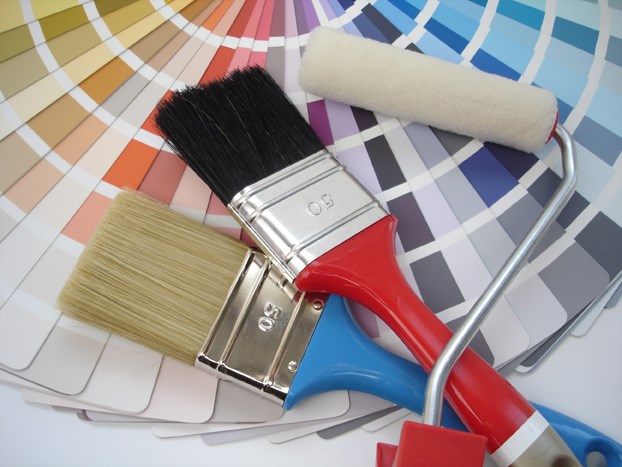
Despite the recent dumping of snow on the North Shore, spring should be making an appearance soon and it’s a great time to add some colour to your rooms.
West Vancouver interior designer Debbie Evans says she loves when a room has little pops of colour.
“They’re just really fun and they’re just really bright,” she says.
Although grey is still a popular overall colour for interiors, Evans has some favourite brighter hues for highlights.
“I love the oranges and the teals. I just think they’re beautiful colours for the spring,” she notes.
Evans says it’s not hard to add some spring colour to your home. The easiest way is to add accent pieces, pillows, throws, rugs, bedspreads and other accessories in the spring colour of your choice. Changing the colour of lamp shades is also an easy addition.
“Switching out the shades can make a huge difference,” says Evans, the owner of Debbie Evans Interior Design.
Painting an accent wall in a bold colour in a room, such as a bedroom, is another option. Evans suggests then keeping bedding fairly neutral and adding pillows, throws, and bed runners, with a touch of colour to match the bold wall.
“It’s always nice to add a little bit of black in something in every room,” she adds. “It just always seems to kind of pull the room together.”
The black can be found in a lamp shade pattern, or a coffee or side table, for example.
A lot of people tend to keep things neutral, says Evans, but notes: “It’s nice if everything is not too matchy.”
Don’t be afraid of mixing either.
“The nicest thing you can do quite often is mix styles and colours and finishes because sometimes it adds texture, it grounds the room a little bit and just gives it that kind of pop,” explains Evans. “You can mix and match almost anything.”
When designing a new look, Evans recommends starting with one main piece, such as your favourite piece, and working around that. If it’s a piece of furniture that you want to stand out then you could tone down other pieces around it, and add accent colours that co-ordinate with that piece.
Evans says there are a lot of monochromatic rooms these days. “Greys are huge right now,” she notes.
But monochromatic rooms can get really boring fast if you don’t add texture or something to make it pop, she says. Adding texture with a heavy shag carpet, or textured pillows may help. While greys have been popular for a year or so, other colours are falling out of favour.
“People are getting sick of the beige tones and the yellow tones,” says Evans.
For years, so-called historical colours were popular because they were warm and cosy. Evans describes them as “muddier,” such as deeper reds.
“But now people seem to want brighter and lighter and greyer, a little bit cooler, not so muddy and just a little bit fresher.”


