Tropical hues are on the horizon for 2019, even here in Raincouver.
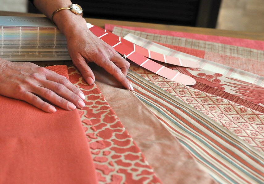
Living Coral has been chosen as the Pantone Color of the Year for 2019 and it has local retailers and interior designers tickled pink. This particular coral colour, they say, is the perfect choice to cheer up a room or outfit on a dreary day.
“You have to here,” says North Vancouver-based interior design consultant Kristin Ames, with a laugh.
In talking to her clients, Ames has learned Vancouverites lean toward more neutral tones to decorate their home. Coral, in this case, makes an excellent accent colour, “especially after you take all the Christmas decorations down.”
“That would be a great time to bring in something in that colour – like a throw or a couple pillows for the couch or something – just to re-energize your space,” says Ames.
Living Coral has been described by Pantone as an "animating and life-affirming" shade of orange with a golden undertone. Vibrant yet mellow, Living Coral emits the “desired, familiar and energizing aspects of colour found in nature.”
Coral-colour beach chairs, watermelons and papayas come to mind for Ames, who predicts by spring you will see a wave of coral hues hit the retail market.
She has confidence in this colour pick from Pantone unlike last year’s Ultra Violet which Ames says didn’t really saturate the market.
“I don’t know that purple is a colour that appeals to a lot of people – whereas the coral is such a warm, energizing, happy colour,” explains Ames. “And of course that colour pairs so well with blue.”
A lot of flowers can found in a coral colour, including roses, poppies and peonies, according to Ames, who owned Posy flower shop in Lynn Valley for a decade before selling it recently and launching her interior design business.
“The coral sunset peony was one of the most soft-after flowers,” says Ames.
When summer arrive, coral placemats or napkins will complement the scenery on an outdoor patio table, she adds.
Moving indoors, a lighter tone of coral, like a blush-peachy colour, could suit a powder room.
“It’s a great colour for reflecting onto your face when you’re doing your makeup,” explains Ames.
Meanwhile, this more tranquil tone of coral can help the sartorially shy dip a toe in the colour, says Victoria Williams, merchandiser at Get Dressed clothing boutique at Westview Shopping Centre.
“To me it’s a little bit softer than a lot of the corals we’ve seen,” says Williams. “It pairs really nicely and not just with white.”
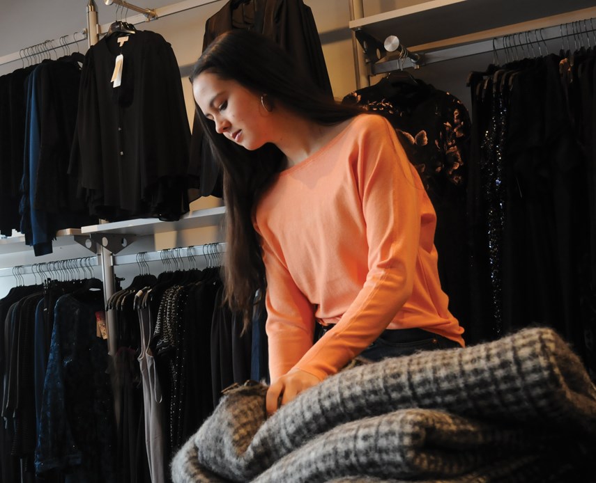
Williams and her Get Dressed co-workers put their trust in Pantone to help make their customer look fashionable.
“These guys are colour specialists – they know that these colours look great together – so you don’t have to be afraid to pair these bold colour choices, especially going into spring and summer when the brighter colours are around,” says Williams.
Living Coral inspires experimentation and playful expression in both men’s and women’s street and runway styles, states a Pantone press release.
“The warm shade suggests comfort and positivity in simple color stories, but becomes more explorative and effervescent in patterns, textures and even monochrome looks.”
Since 2000, the U.S.-based Pantone Color Institute has declared a colour of the year.
Twice a year the company hosts, in a European capital, a secret meeting of representatives from various nations’ colour standards groups.
After deliberating for two days, the Pantone council makes its pick for the following year and watches the colour saturate all the different retail markets, from fashion to interior design to automotive.
To arrive at the selection each year, Pantone’s colour experts comb the world looking for new colour influences. This can include the entertainment industry, travelling art collections, popular travel destinations, as well as new lifestyles and socioeconomic conditions.
Colour influences may also stem from new technologies, including the coral variant found in the iPhone XR.
Contrary to popular belief, the Pantone Color of the Year isn’t a trends forecast but rather a reflection or colour snapshot of what’s currently taking place in the world, according to Laurie Pressman, vice president of the Pantone Color Institute.


